- Made by AppCoda
- Contact us / Support
- Tweet this book
- 序言
- 1. SwiftUI 介紹
- 2. SwiftUI 入門 - 文字的處理
- 3. 圖片的處理
- 4. 以堆疊佈局使用者介面
- 5. ScrollView 與 Carousel UI 的建立
- 6. SwiftUI 按鈕與漸層
- 7. 狀態(State)與綁定(Binding)
- 8. 實作路徑(Path)與形狀(Shape)來畫線與圓餅圖
- 9. 基礎動畫與轉場
- 10. 動態列表、 ForEach 與 Identifiable 的使用方法
- 11. 導覽UI與導覽列客製化運用
- 12. 強制回應視圖、浮動按鈕與提示的實作
- 13. 以選取器(Picker)、開關(Toggle)與步進器(Stepper)來建立一個表單
- 14. 使用 Combine 與 Environment 物件進行資料分享
- 15. 以 Combine 與 視圖模型建立一個註冊表單
- 16. 滑動刪除、內容選單與動作列表
- 17. 認識手勢(Gestures)
- 18. 利用 Presentation Detents 建立展開式底部表
- 19. 使用手勢與動畫建立 Tinder 風格的 UI
- 20. 建立像 Apple Wallet App 的動畫和轉場效果
- 21. JSON、滑桿的運用與資料過濾
- 22. 如何使用 SwiftData 建立 ToDo App
- 23. 利用 UIViewRepresentable 整合UIKit 組件
- 24. 建立搜尋欄視圖並使用自訂綁定(Custom Binding)
- 25. 把所學應用出來!構建個人理財App
- 26. 創建類似App Store使用的動畫視圖轉換
- 27. 如何建立圖像輪播(Image Carousel)
- 28. 如何建立展開式列表視圖和大綱視圖
- 29. 使用 LazyVGrid 和 LazyHGrid 構建集合視圖
- 30. 使用 Shape 和 Animatable 開發帶動畫的環形進度條
- 31. 如何使用 AnimatableModifier 和 LibraryContentProvider
- 32. 使用 TextEditor 支援多行文字輸入
- 33. 使用 matchedGeometryEffect為 App 建立絢麗的視圖動畫
- 34. ScrollViewReader 和網格動畫
- 35. 標籤視圖的運用與自訂標籤列
- 36. 利用 AsyncImage 非同步加載和顯示圖像
- 37. 利用 Searchable 建立搜尋欄
- 38. 利用 Charts 框架建立圖表
- 39. 利用 Live Text API 從圖片中擷取文本
- 40. 透過 ShareLink 來分享文本和圖像等資料
- 41. 利用 ImageRenderer API 輕鬆把 SwiftUI 視圖轉換為圖像
- 42. 如何把 SwiftUI 視圖轉換為 PDF 文件
- 43. 使用 Gauge 視圖顯示進度並創建速度計
- 44. 使用Grid API 創建網格佈局
- 45. 利用 AnyLayout 切換 UI 佈局
- 46. 使用地圖和標註
- 47. 如何使用 Preview Macro
- 48. 建立圓餅圖和甜甜圈圖
- 49. 使用 SwiftUI 偵測 ScrollView 中的捲動位置
- 50. 使用 SwiftUI 動畫捲動視圖
- 51. 使用 UnevenRoundedRectangle 來圓角特定的角落
- 52. 使用 SwiftData 管理資料庫
- 53. 如何在 iOS App 中嵌入照片選擇器
- 54. 使用 PhaseAnimator 創建動態的動畫
- 55. 使用 KeyframeAnimator 建立進階動畫
- 56. 使用 TipKit 建立工具提示
- 本書使用 GitBook 釋出
第 31 章
如何使用 AnimatableModifier 和 LibraryContentProvider
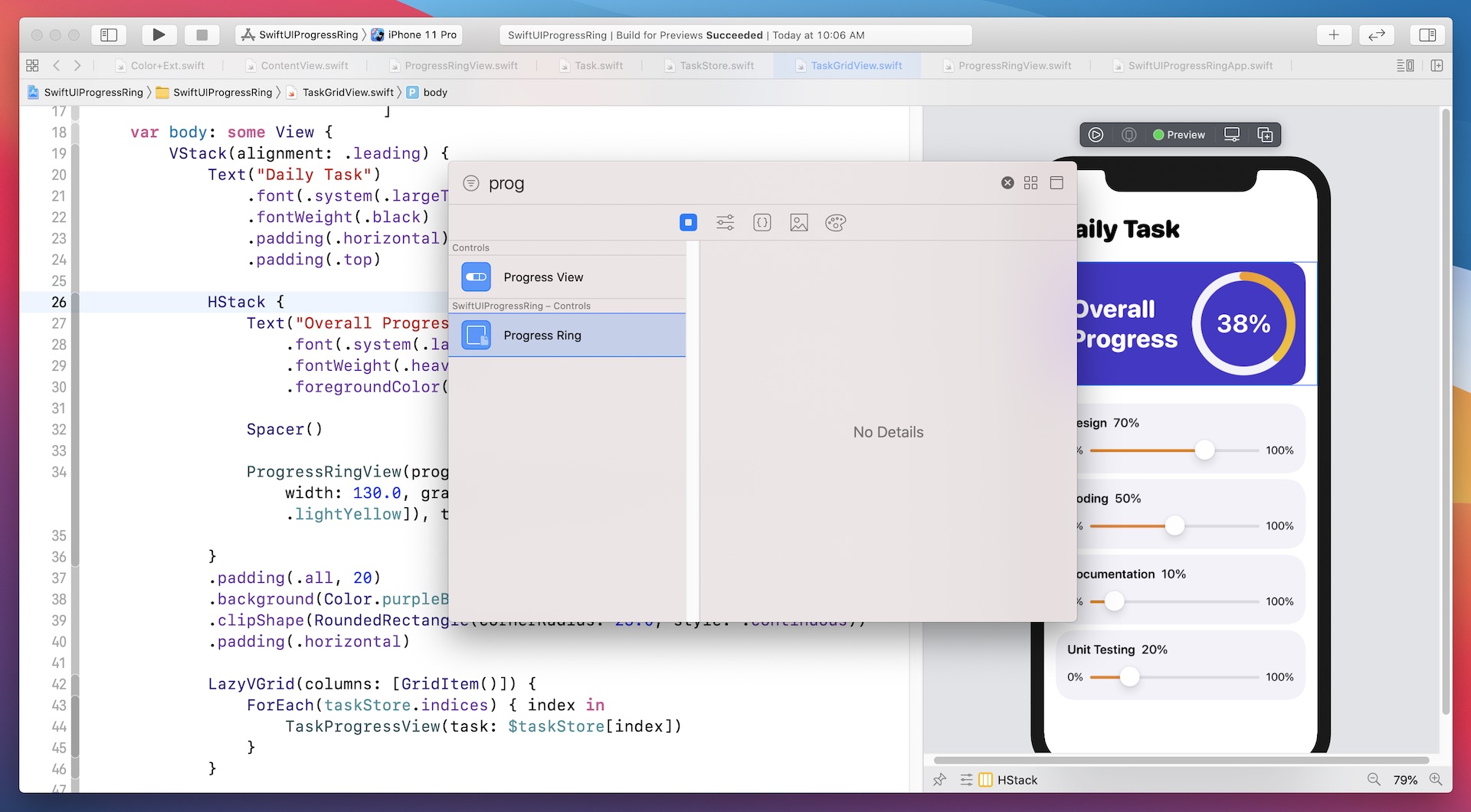
之前,你學習瞭如何使用 Animatable 和 AnimatableData 為環形進度條設置動畫。 在本章中,我們將更進一步,向你展示如何使用另一個名為 AnimatableModifier 的協議為視圖設置動畫。 此外,我將向你介紹 SwiftUI 的一個新功能,該功能將允許開發者輕鬆地將客製化視圖共享到視圖庫讓你更易重用自製的元件。 稍後,我將向你展示如何將進度環視圖加到視圖庫中以供重用。 先睹為快,你可以看看圖 31.1 或觀看此示範視頻 (https://link.appcoda.com/librarycontentprovider) 了解如何LibraryContentProvider如何運作。
AnimatableModifier 簡介
我們先來看看 AnimatableModifier 協議。 顧名思義,AnimatableModifier 是一個視圖修飾器,而它符合 Animatable 協議。 也因為此,這修飾器可以將不同類型視圖的改變動畫化。
protocol AnimatableModifier : Animatable, ViewModifier
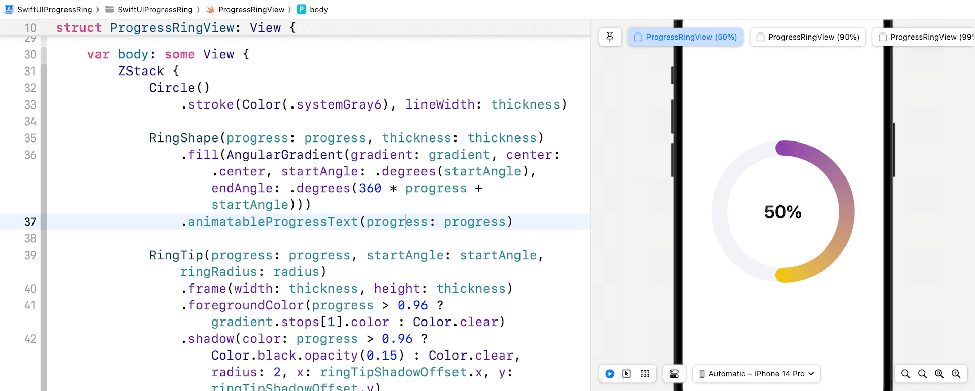
那麼,我們要製作什麼動畫呢? 我們將以在前一章的示例為基礎再添加一個文字標籤。這標籤會顯示當前進度百分比。 隨著進度條的移動,標籤也相應更新。 圖 31.2 顯示了標籤的外觀。
使用 AnimatableModifer 建立文字動畫
我強烈建議你先閱讀第 30 章,因為這個示範項目是建基於前一個項目之上的。 如果你還沒有做過該項目,你可以在 https://www.appcoda.com/resources/swiftui5/SwiftUIProgressRingExercise.zip 下載。
在我們深入了解 AnimatableModifier 協議之前,讓我問你。 你將如何佈局進度標籤並為其設置動畫? 如果你還記得,其實我們在第 9 章中構建了一個類似的進度指示器。根據你所學,可以像這樣佈局進度標籤(在 ProgressRingView.swift 中):
ZStack {
    Circle()
        .stroke(Color(.systemGray6), lineWidth: thickness)

    Text(progressText)
        .font(.system(.largeTitle, design: .rounded))
        .fontWeight(.bold)
        .foregroundStyle(.black)

    ...
}
你可以在 ZStack 中添加一個 Text 視圖,並使用以下方式格式化文本以顯示當前進度:
private var progressText: String {
    let formatter = NumberFormatter()
    formatter.numberStyle = .percent
    formatter.percentSymbol = "%"

    return formatter.string(from: NSNumber(value: progress)) ?? ""
}
由於 progress 變數是一個狀態變數,所以每當 progress 的值發生變化時,progressText 都會自動更新。 但是,解決方案存在一個問題,就是文字的動畫效果不太好。
如果你在 ProgressRingView.swift 中更改了程式碼,則可以返回 ContentView.swift 查看結果。 此App確實顯示了進度標籤,但是當你將進度從一個值改為另一個值時,進度標籤會立即使用淡出的動畫效果來顯示新值。
這不是我們所寄望的結果。 進度標籤不應直接從一個值(例如 100%)跳轉到另一個值(例如 50%)。 我們期望進度標籤跟隨進度條的動畫並逐步更新其值,如下所示:
100 -> 99 -> 98 -> 97 -> 96 ... ... ... ... ... ... ... ... ... ... 53 -> 52 -> 51 -> 50
當前的做法不允許你為文字的變化設置動畫, 這就是為什麼我必須向你介紹 AnimatableModifier 協議的原因。
為了製作文字動畫,我們將在 ProgressRingView.swift 中創建一個名為 ProgressTextModifier 的新結構,並採用 AnimatableModifier:
struct ProgressTextModifier: AnimatableModifier {

    var progress: Double = 0.0
    var textColor: Color = .primary

    private var progressText: String {
        let formatter = NumberFormatter()
        formatter.numberStyle = .percent
        formatter.percentSymbol = "%"

        return formatter.string(from: NSNumber(value: progress)) ?? ""
    }

    var animatableData: Double {
        get { progress }
        set { progress = newValue }
    }

    func body(content: Content) -> some View {
        content
            .overlay(
                Text(progressText)
                    .font(.system(.largeTitle, design: .rounded))
                    .fontWeight(.bold)
                    .foregroundStyle(textColor)
                    .animation(nil)
            )
    }
}
對你來說,這些程式碼是不是很熟悉? 如前所述,AnimatableModifier 協議同時符合 Animatable 和 ViewModifier。 因此,我們在 animatableData 屬性中指定動畫的值。 這裡是progress。 為了符合 ViewModifier 的要求,我們實現了 body 函數並添加了 Text 視圖。
就是這樣使用 AnimatableModifier 為文字加置動畫。 為方便起見,在 ProgressRingView 的末尾插入以下程式碼,以創建用於 ProgressTextModifier 的擴展:
extension View {
    func animatableProgressText(progress: Double, textColor: Color = Color.primary) -> some View {
        self.modifier(ProgressTextModifier(progress: progress, textColor: textColor))
    }
}
現在你可以像以下程式碼將 animatableProgressText 修飾器附加到 RingShape 上:
RingShape(progress: progress, thickness: thickness)
    .fill(AngularGradient(gradient: gradient, center: .center, startAngle: .degrees(startAngle), endAngle: .degrees(360 * progress + startAngle)))
    .animatableProgressText(progress: progress)
更改後,你應該會在預覽列看到進度標籤。 要測試動畫,請在 iPhone 模擬器上運行App或在 ContentView.swift 中執行App。 當你更改進度時,進度文字已經帶有動畫。
使用 LibraryContentProvider
Xcode 提供了一項強大的功能,允許開發者將任何客製化視圖加到 View 圖庫中。 如果你忘記了 View 圖庫是什麼,只需按 command-shift-L 即可把它帶出來。 該圖庫可讓你輕鬆找尋所有可用的 UI 元件。 你可以從庫中拖動元件並將其直接添加到App UI。
Xcode 允許開發者使用名為LibraryContentProvider的協議將客製化視圖添加到圖庫中。 要將客製化視圖視圖添加到視圖庫,你需要建立一個符合 LibraryContentProvider 協議的新結構。
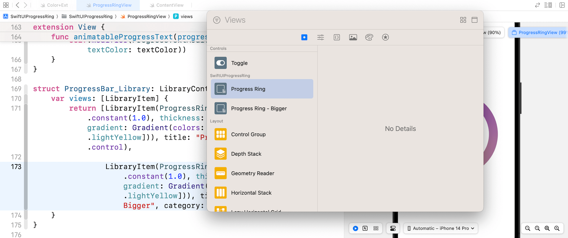
例如,要將進度環視圖共享到視圖庫,我們可以在 ProgressRingView.swift 中創建一個名為 ProgressBar_Library 的結構,如下所示:
struct ProgressBar_Library: LibraryContentProvider {
    @LibraryContentBuilder var views: [LibraryItem] {
        LibraryItem(ProgressRingView(progress: .constant(1.0), thickness: 12.0, width: 130.0, gradient: Gradient(colors: [.darkYellow, .lightYellow])), title: "Progress Ring", category: .control)
    }
}
你建立一個符合 LibraryContentProvider 的結構並覆載 views 屬性以回一個客製化視圖陣列。 在上面的程式碼,我們回了帶有一些預設值的進度環視圖,將其命名為Progress Ring,並將其放入元件類別中。
或者,如果你想添加多個庫項目,你可以編寫如下程式碼:
struct ProgressBar_Library: LibraryContentProvider {
    @LibraryContentBuilder var views: [LibraryItem] {
        LibraryItem(ProgressRingView(progress: .constant(1.0), thickness: 12.0, width: 130.0, gradient: Gradient(colors: [.darkYellow, .lightYellow])), title: "Progress Ring", category: .control)

        LibraryItem(ProgressRingView(progress: .constant(1.0), thickness: 30.0, width: 250.0, gradient: Gradient(colors: [.darkPurple, .lightYellow])), title: "Progress Ring - Bigger", category: .control)
    }
}
再講多一點點,你可以為項目的類別提供四種值,具體取決於圖庫項目所代表的內容:
controleffectlayoutother
你可能還未知道 @LibraryContentBuilder 屬性包裝器是什麼? 它只是使你免於編寫用於創建LibraryItem陣列的程式碼。 上面的程式碼其實可以改寫成這樣:
struct ProgressBar_Library: LibraryContentProvider {
    var views: [LibraryItem] {
        return [LibraryItem(ProgressRingView(progress: .constant(1.0), thickness: 12.0, width: 130.0, gradient: Gradient(colors: [.darkYellow, .lightYellow])), title: "Progress Ring", category: .control),

                LibraryItem(ProgressRingView(progress: .constant(1.0), thickness: 30.0, width: 250.0, gradient: Gradient(colors: [.darkPurple, .lightYellow])), title: "Progress Ring - Bigger", category: .control)
    }
}
當你加入程式碼後,Xcode 會自動發現項目中新加入的LibraryContentProvider協議,並將進度環視圖添加到視圖庫中。 你現在可以輕易將進度環視圖添加到App UI。
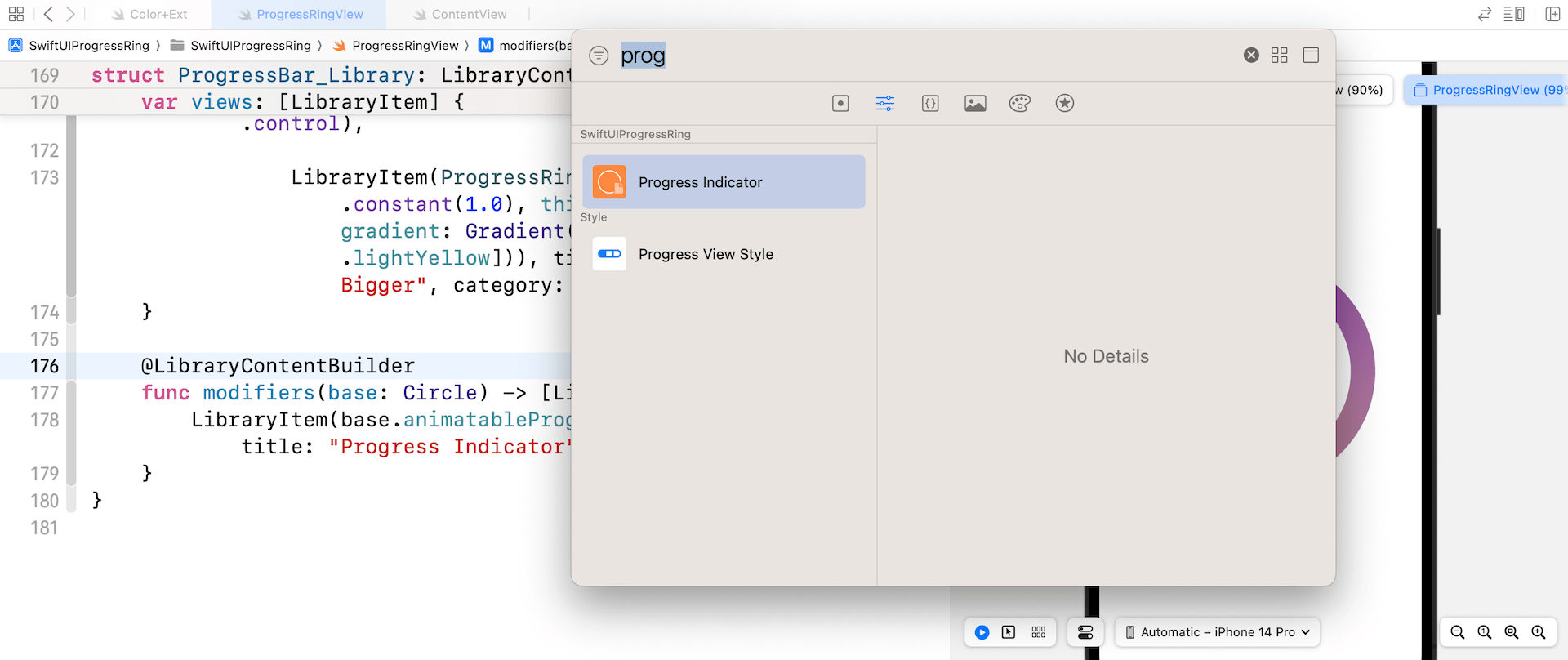
你不僅可以將客製化視圖加至 Xcode 的視圖庫,還可以通過實現 modifiers 方法添加自己製的修飾器。 你可以通過如下方法將 animatableProgressText 修飾器添加到視圖庫:
struct ProgressBar_Library: LibraryContentProvider {
    .
    .
    .

    @LibraryContentBuilder
    func modifiers(base: Circle) -> [LibraryItem] {
        LibraryItem(base.animatableProgressText(progress: 1.0), title: "Progress Indicator", category: .control)
    }
}
base 參數允許你指定可以由修飾器修改的元件類型。 在上面的程式碼,那個元件就是 Circle 視圖。 同樣地,一旦你將程式碼加入ProgressBar_Library,Xcode 就會自動掃描相關項目並將其添加到修改器庫中。
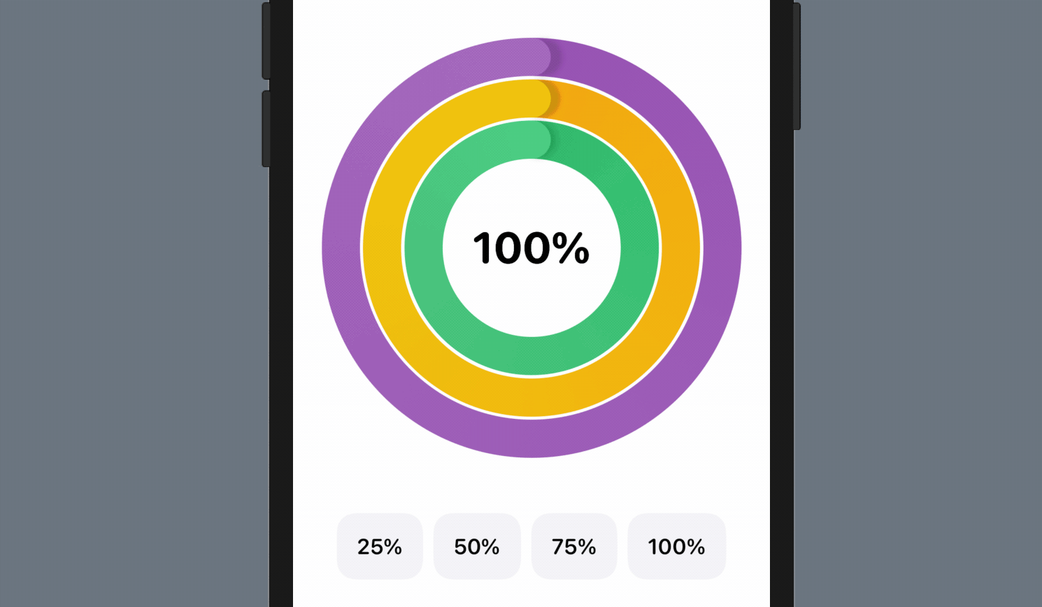
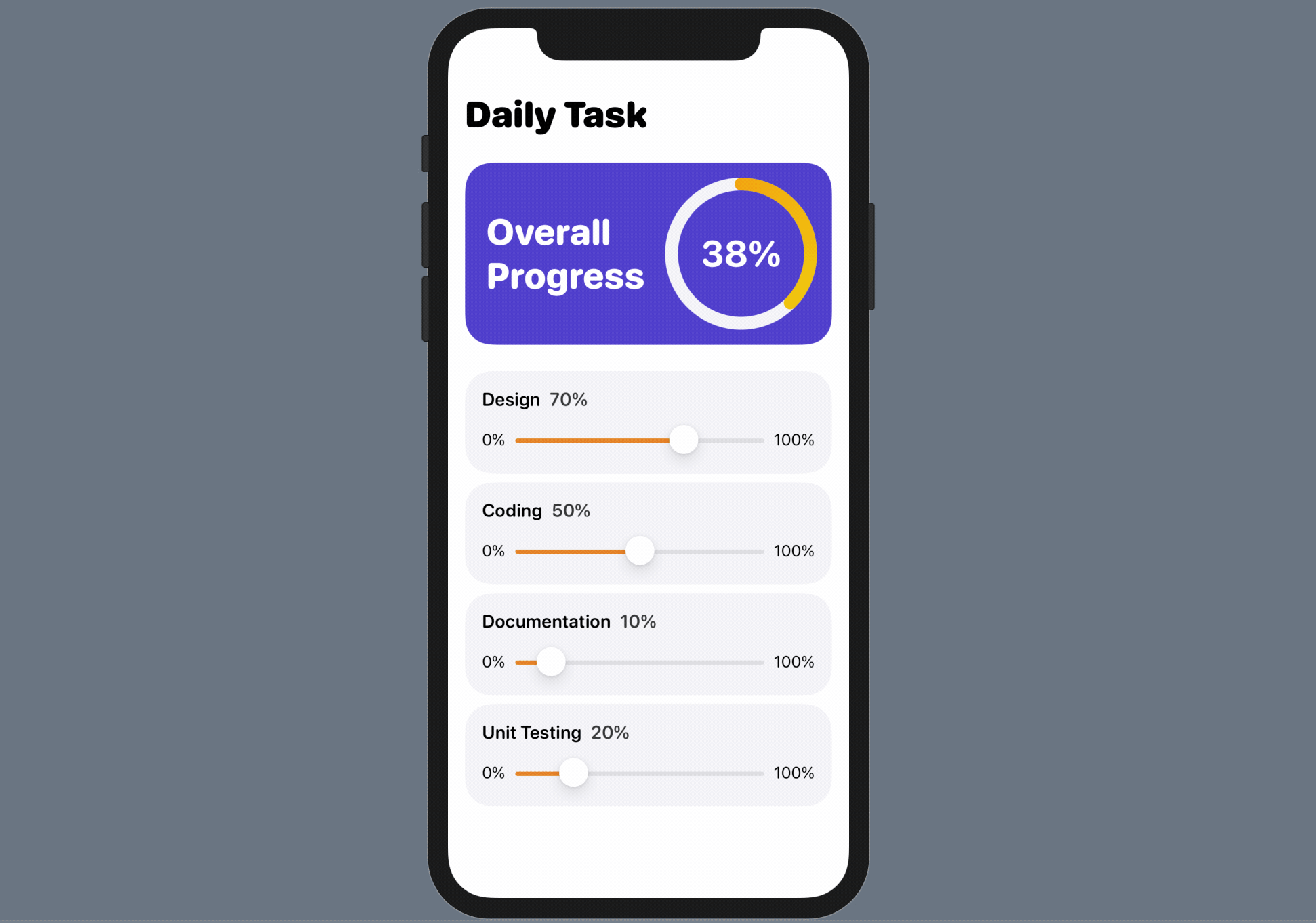
練習
進度環現在已合併到視圖庫中, 嘗試使用它並構建一個如下圖所示的App。 該App有 4 個 sliders,用於調整不同任務的進度。 除此之外,它也會計算並顯示總體進度。
總結
AnimatableModifier 協議是一個非常強大的協議,可為任何視圖的變化建立動畫。 在本章中,我們向你介紹了如何為標籤的文字設置動畫。 你可以應用此技巧為其他值設置動畫,例如顏色和大小。
LibraryContentProvider 使開發者非常輕鬆地共享客製化視圖並鼓勵重用程式碼。 想像一下,你可以構建一個客製化組件庫並將它們放入 View/Modifier 庫中,團隊中的每個成員都可以輕鬆取得並使用元件。 在這一章,你只學習如何在同一個 Xcode 項目中使用這些元件。 往後,我們將討論如何使用 Swift Package 來讓你將元件分享至不同Xcode項目。
在本章所準備的範例檔中,有最後完整的 Xcode 專案,可供你下載參考: