- Made by AppCoda
- Contact us / Support
- Tweet this book
- 序言
- 1. SwiftUI 介紹
- 2. SwiftUI 入門 - 文字的處理
- 3. 圖片的處理
- 4. 以堆疊佈局使用者介面
- 5. ScrollView 與 Carousel UI 的建立
- 6. SwiftUI 按鈕與漸層
- 7. 狀態(State)與綁定(Binding)
- 8. 實作路徑(Path)與形狀(Shape)來畫線與圓餅圖
- 9. 基礎動畫與轉場
- 10. 動態列表、 ForEach 與 Identifiable 的使用方法
- 11. 導覽UI與導覽列客製化運用
- 12. 強制回應視圖、浮動按鈕與提示的實作
- 13. 以選取器(Picker)、開關(Toggle)與步進器(Stepper)來建立一個表單
- 14. 使用 Combine 與 Environment 物件進行資料分享
- 15. 以 Combine 與 視圖模型建立一個註冊表單
- 16. 滑動刪除、內容選單與動作列表
- 17. 認識手勢(Gestures)
- 18. 利用 Presentation Detents 建立展開式底部表
- 19. 使用手勢與動畫建立 Tinder 風格的 UI
- 20. 建立像 Apple Wallet App 的動畫和轉場效果
- 21. JSON、滑桿的運用與資料過濾
- 22. 如何使用 SwiftData 建立 ToDo App
- 23. 利用 UIViewRepresentable 整合UIKit 組件
- 24. 建立搜尋欄視圖並使用自訂綁定(Custom Binding)
- 25. 把所學應用出來!構建個人理財App
- 26. 創建類似App Store使用的動畫視圖轉換
- 27. 如何建立圖像輪播(Image Carousel)
- 28. 如何建立展開式列表視圖和大綱視圖
- 29. 使用 LazyVGrid 和 LazyHGrid 構建集合視圖
- 30. 使用 Shape 和 Animatable 開發帶動畫的環形進度條
- 31. 如何使用 AnimatableModifier 和 LibraryContentProvider
- 32. 使用 TextEditor 支援多行文字輸入
- 33. 使用 matchedGeometryEffect為 App 建立絢麗的視圖動畫
- 34. ScrollViewReader 和網格動畫
- 35. 標籤視圖的運用與自訂標籤列
- 36. 利用 AsyncImage 非同步加載和顯示圖像
- 37. 利用 Searchable 建立搜尋欄
- 38. 利用 Charts 框架建立圖表
- 39. 利用 Live Text API 從圖片中擷取文本
- 40. 透過 ShareLink 來分享文本和圖像等資料
- 41. 利用 ImageRenderer API 輕鬆把 SwiftUI 視圖轉換為圖像
- 42. 如何把 SwiftUI 視圖轉換為 PDF 文件
- 43. 使用 Gauge 視圖顯示進度並創建速度計
- 44. 使用Grid API 創建網格佈局
- 45. 利用 AnyLayout 切換 UI 佈局
- 46. 使用地圖和標註
- 47. 如何使用 Preview Macro
- 48. 建立圓餅圖和甜甜圈圖
- 49. 使用 SwiftUI 偵測 ScrollView 中的捲動位置
- 50. 使用 SwiftUI 動畫捲動視圖
- 51. 使用 UnevenRoundedRectangle 來圓角特定的角落
- 52. 使用 SwiftData 管理資料庫
- 53. 如何在 iOS App 中嵌入照片選擇器
- 54. 使用 PhaseAnimator 創建動態的動畫
- 55. 使用 KeyframeAnimator 建立進階動畫
- 56. 使用 TipKit 建立工具提示
- 本書使用 GitBook 釋出
第 43 章
使用 Gauge 視圖顯示進度並創建速度計
在 iOS 16,SwiftUI 引入了一個新視圖 Gauge,用來顯示進度。我們可以利用這個視圖,來顯示一定範圍內的數值。在這篇教學文章中,讓我們來看看如何使用 Gauge 視圖,以及如何使用不同的 Gauge 樣式。
Gauge 視圖是用來顯示當前數值在有限範圍中的水平,就像是汽車中的油量錶。開發者可以配置 Gauge 的顯示,例如是 Gauge 當前的數值、範圍、及描述其的用途的標籤。
- Apple 官方文件
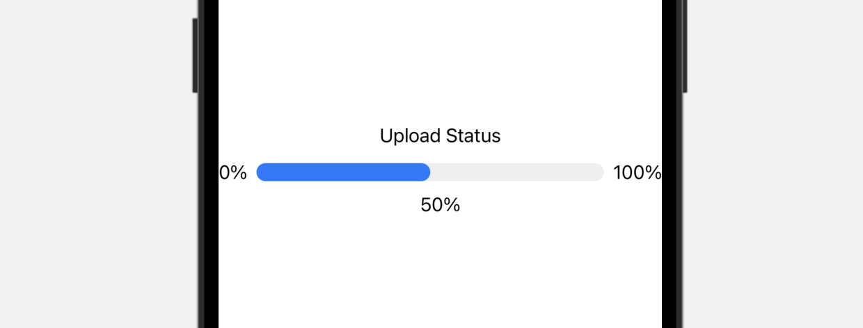
Gauge 最簡單的使用方法是這樣的:
struct ContentView: View {
    @State private var progress = 0.5

    var body: some View {
        Gauge(value: progress) {
            Text("Upload Status")
        }
    }
}
在最基本的形式中,Gauge 的預設範圍是 0 到 1。如果我們將 value 參數設置為 0.5,SwiftUI 就會呈現一個進度條,指示任務已完成了 50%。
或者,我們也可以為 current value、minimum value 和 maximum value 設置標籤:
Gauge(value: progress) {
    Text("Upload Status")
} currentValueLabel: {
    Text(progress.formatted(.percent))
} minimumValueLabel: {
    Text(0.formatted(.percent))
} maximumValueLabel: {
    Text(100.formatted(.percent))
}
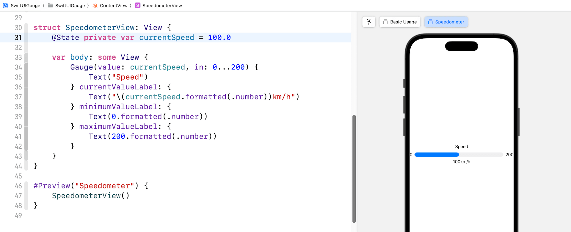
使用客製化範圍
Gauge 的預設範圍是 0 到 1,也就是說,我們可以客製化想要的範圍。舉個例子,我們正在構建一個速度計,其最高速率為 200 公里每小時。我們可以在 in 參數中指定範圍:
struct SpeedometerView: View {
    @State private var currentSpeed = 100.0

    var body: some View {
        Gauge(value: currentSpeed, in: 0...200) {
            Text("Speed")
        } currentValueLabel: {
            Text("\(currentSpeed.formatted(.number))km/h")
        } minimumValueLabel: {
            Text(0.formatted(.number))
        } maximumValueLabel: {
            Text(200.formatted(.number))
        }
    }
}
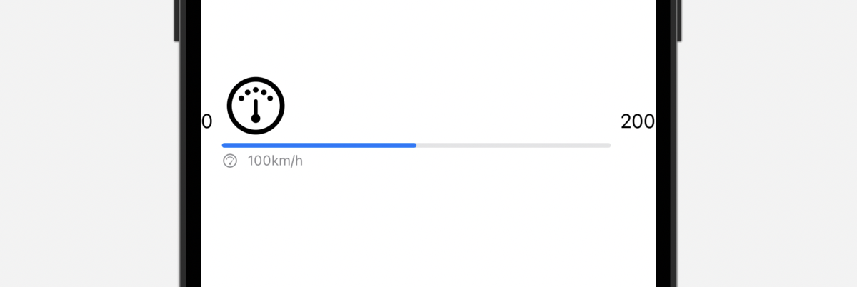
在以上的程式碼中,我們設置範圍為 0...200,也在預覽結構中添加了 SpeedometerView。現在,如果我們把當前速度設置為 100 公里每小時,預覽應該會填滿進度條的一半。
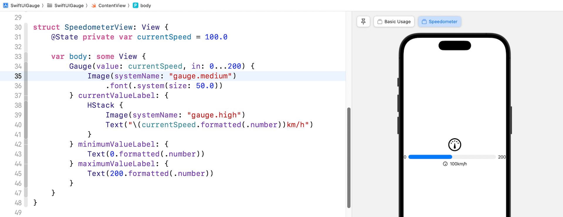
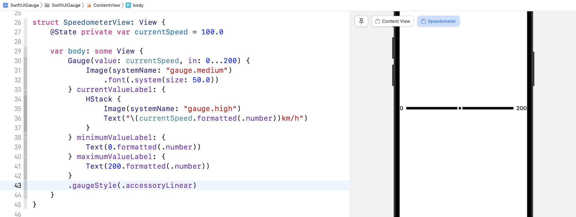
使用 Image Labels
我們也可以使用 text label 來顯示範圍和當前數值。讓我們看看以下例子:
Gauge(value: currentSpeed, in: 0...200) {
    Image(systemName: "gauge.medium")
        .font(.system(size: 50.0))
} currentValueLabel: {
    HStack {
        Image(systemName: "gauge.high")
        Text("\(currentSpeed.formatted(.number))km/h")
    }
} minimumValueLabel: {
    Text(0.formatted(.number))
} maximumValueLabel: {
    Text(200.formatted(.number))
}
我們將 Gauge 的 text label 更改為系統圖像,並為當前數值的 label 創建一個堆疊 (stack),來排列圖像和文本。完成後,預覽應該會是這樣的:
客製化 Gauge 樣式
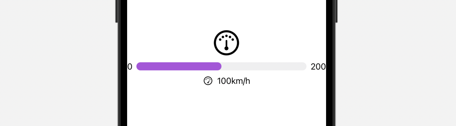
Gauge 視圖預設的顏色是藍色。要客製化 Gauge 視圖的顏色,我們可以附加 tint 修飾符,並設置想要的顏色:
Gauge(value: currentSpeed, in: 0...200) {
    Image(systemName: "gauge.medium")
        .font(.system(size: 50.0))
} currentValueLabel: {
    HStack {
        Image(systemName: "gauge.high")
        Text("\(currentSpeed.formatted(.number))km/h")
    }
} minimumValueLabel: {
    Text(0.formatted(.number))
} maximumValueLabel: {
    Text(200.formatted(.number))
}
.tint(.purple)
Gauge 視圖的外觀與 ProgressView 非常相似。我們也可以使用 gaugeStyle 修飾符來客製化 Gauge 視圖,這個修飾符支援多種內建樣式。
linearCapacity
這是預設的樣式,顯示從左到右填滿的進度條,就像上文的紫色進度條。
accessoryLinear
這個樣式會顯示一個進度條,當中有一個 point marker 指示當前數值。
accessoryLinearCapacity
這個樣式的 Gauge 會顯示一個比較幼的進度條。
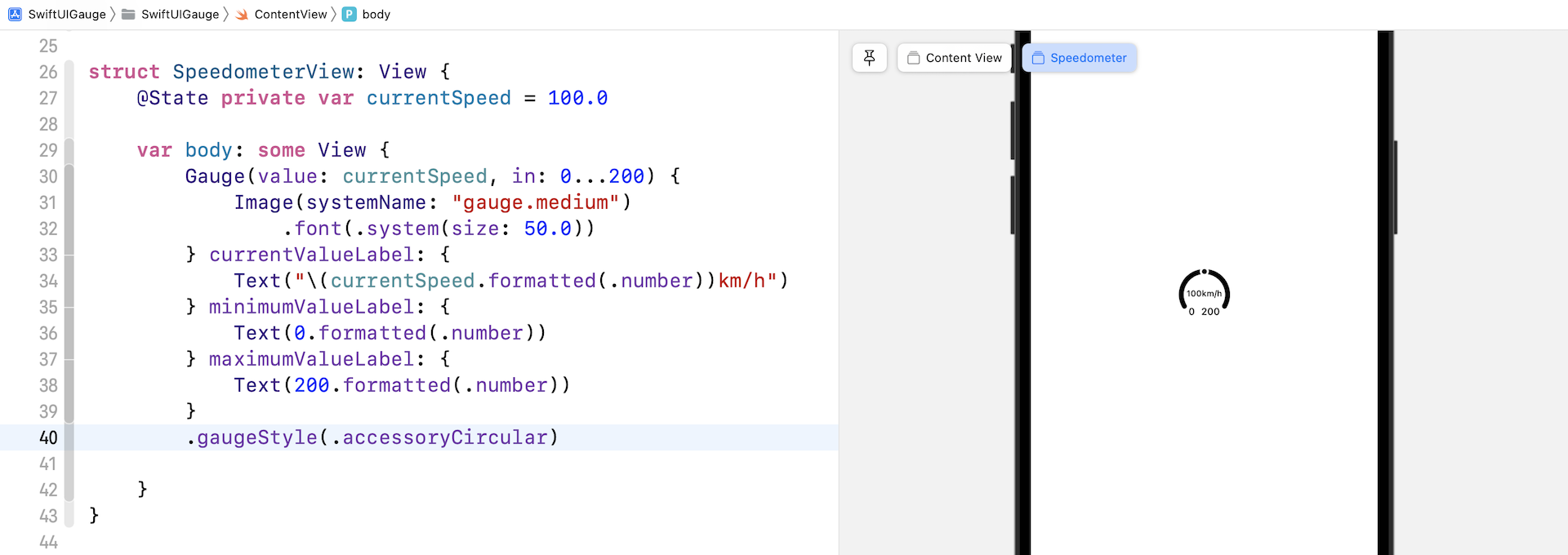
accessoryCircular
這個樣式的 Gauge 不再是顯示一個進度條,而是一個開口環形 (open ring),當中有一個 point marker 指示當前數值。
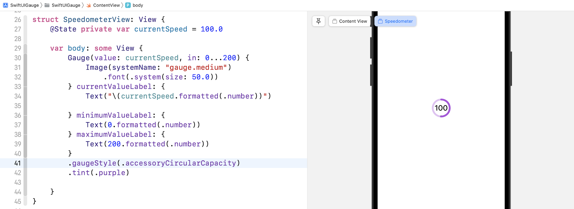
accessoryCircularCapacity
這個樣式的 Gauge 會顯示一個閉口環形 (closed ring),以填滿的部分來反映當前數值,而當前數值也會在 Gauge 的中間顯示出來。
建立一個客製化的 Gauge 樣式
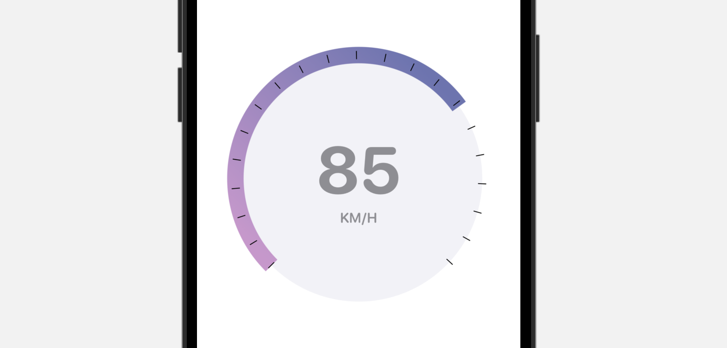
內建的 Gauge 樣式有限,但是我們可以利用 SwiftUI 來建立自己的 Gauge 樣式。讓我們看看一個簡單的範例,來建立上圖的 Gauge 樣式吧!
要建立一個客製化的 Gauge 樣式,我們需要採用 GaugeStyle 協定,並編寫自己的實作。以下是我們的客製化樣式的實作:
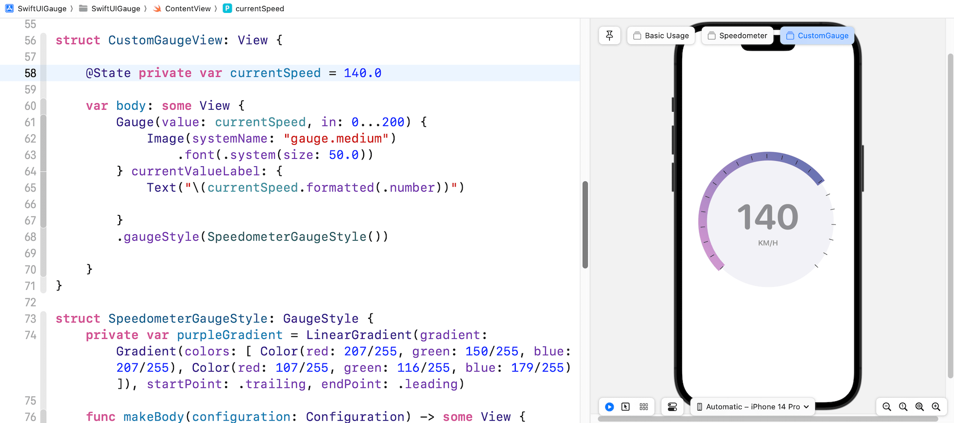
struct SpeedometerGaugeStyle: GaugeStyle {
    private var purpleGradient = LinearGradient(gradient: Gradient(colors: [ Color(red: 207/255, green: 150/255, blue: 207/255), Color(red: 107/255, green: 116/255, blue: 179/255) ]), startPoint: .trailing, endPoint: .leading)

    func makeBody(configuration: Configuration) -> some View {
        ZStack {

            Circle()
                .foregroundStyle(Color(.systemGray6))

            Circle()
                .trim(from: 0, to: 0.75 * configuration.value)
                .stroke(purpleGradient, lineWidth: 20)
                .rotationEffect(.degrees(135))

            Circle()
                .trim(from: 0, to: 0.75)
                .stroke(Color.black, style: StrokeStyle(lineWidth: 10, lineCap: .butt, lineJoin: .round, dash: [1, 34], dashPhase: 0.0))
                .rotationEffect(.degrees(135))

            VStack {
                configuration.currentValueLabel
                    .font(.system(size: 80, weight: .bold, design: .rounded))
                    .foregroundStyle(.gray)
                Text("KM/H")
                    .font(.system(.body, design: .rounded))
                    .bold()
                    .foregroundStyle(.gray)
            }

        }
        .frame(width: 300, height: 300)

    }

}
為了遵從 GaugeStyle 協定,我們需要實作 makeBody 方法,來顯示我們自己的 Gauge 樣式。configuration 捆綁了 Gauge 的當前數值和數值的 label。在上面的程式碼中,我們使用了這兩個數值,來顯示當前速率,並計算弧形的長度。
我們實作好客製化的 Gauge 樣式後,就可以附加到 gaugeStyle 修飾器上來應用它。
struct CustomGaugeView: View {

    @State private var currentSpeed = 140.0

    var body: some View {
        Gauge(value: currentSpeed, in: 0...200) {
            Image(systemName: "gauge.medium")
                .font(.system(size: 50.0))
        } currentValueLabel: {
            Text("\(currentSpeed.formatted(.number))")

        }
        .gaugeStyle(SpeedometerGaugeStyle())

    }
}
我另外為這個範例建立了一個視圖。要預覽 CustomGaugeView,我們需要加入另一個 #Previews :
#Preview("CustomGauge") {
    CustomGaugeView()
}
就是這樣!更新好之後,預覽就會顯示客製化的 Gauge。
總結
在本章中,你學習了如何使用新的Gauge視圖構建速度計。 除了速度計,你還可以使用 Gauge 來顯示進度或任何其他測量值。 Gauge 視圖是可靈活運用的。 你只需要採用 GaugeStyle 協議就可以創建自己的 Gauge 樣式。
在本章所準備的範例檔中,有最後完整的 Xcode 專案,可供你下載參考: