- Made by AppCoda
- Contact us / Support
- Tweet this book
- 序言
- 1. SwiftUI 介紹
- 2. SwiftUI 入門 - 文字的處理
- 3. 圖片的處理
- 4. 以堆疊佈局使用者介面
- 5. ScrollView 與 Carousel UI 的建立
- 6. SwiftUI 按鈕與漸層
- 7. 狀態(State)與綁定(Binding)
- 8. 實作路徑(Path)與形狀(Shape)來畫線與圓餅圖
- 9. 基礎動畫與轉場
- 10. 動態列表、 ForEach 與 Identifiable 的使用方法
- 11. 導覽UI與導覽列客製化運用
- 12. 強制回應視圖、浮動按鈕與提示的實作
- 13. 以選取器(Picker)、開關(Toggle)與步進器(Stepper)來建立一個表單
- 14. 使用 Combine 與 Environment 物件進行資料分享
- 15. 以 Combine 與 視圖模型建立一個註冊表單
- 16. 滑動刪除、內容選單與動作列表
- 17. 認識手勢(Gestures)
- 18. 利用 Presentation Detents 建立展開式底部表
- 19. 使用手勢與動畫建立 Tinder 風格的 UI
- 20. 建立像 Apple Wallet App 的動畫和轉場效果
- 21. JSON、滑桿的運用與資料過濾
- 22. 如何使用 SwiftData 建立 ToDo App
- 23. 利用 UIViewRepresentable 整合UIKit 組件
- 24. 建立搜尋欄視圖並使用自訂綁定(Custom Binding)
- 25. 把所學應用出來!構建個人理財App
- 26. 創建類似App Store使用的動畫視圖轉換
- 27. 如何建立圖像輪播(Image Carousel)
- 28. 如何建立展開式列表視圖和大綱視圖
- 29. 使用 LazyVGrid 和 LazyHGrid 構建集合視圖
- 30. 使用 Shape 和 Animatable 開發帶動畫的環形進度條
- 31. 如何使用 AnimatableModifier 和 LibraryContentProvider
- 32. 使用 TextEditor 支援多行文字輸入
- 33. 使用 matchedGeometryEffect為 App 建立絢麗的視圖動畫
- 34. ScrollViewReader 和網格動畫
- 35. 標籤視圖的運用與自訂標籤列
- 36. 利用 AsyncImage 非同步加載和顯示圖像
- 37. 利用 Searchable 建立搜尋欄
- 38. 利用 Charts 框架建立圖表
- 39. 利用 Live Text API 從圖片中擷取文本
- 40. 透過 ShareLink 來分享文本和圖像等資料
- 41. 利用 ImageRenderer API 輕鬆把 SwiftUI 視圖轉換為圖像
- 42. 如何把 SwiftUI 視圖轉換為 PDF 文件
- 43. 使用 Gauge 視圖顯示進度並創建速度計
- 44. 使用Grid API 創建網格佈局
- 45. 利用 AnyLayout 切換 UI 佈局
- 46. 使用地圖和標註
- 47. 如何使用 Preview Macro
- 48. 建立圓餅圖和甜甜圈圖
- 49. 使用 SwiftUI 偵測 ScrollView 中的捲動位置
- 50. 使用 SwiftUI 動畫捲動視圖
- 51. 使用 UnevenRoundedRectangle 來圓角特定的角落
- 52. 使用 SwiftData 管理資料庫
- 53. 如何在 iOS App 中嵌入照片選擇器
- 54. 使用 PhaseAnimator 創建動態的動畫
- 55. 使用 KeyframeAnimator 建立進階動畫
- 56. 使用 TipKit 建立工具提示
- 本書使用 GitBook 釋出
第 26 章
創建類似App Store使用的動畫視圖轉換
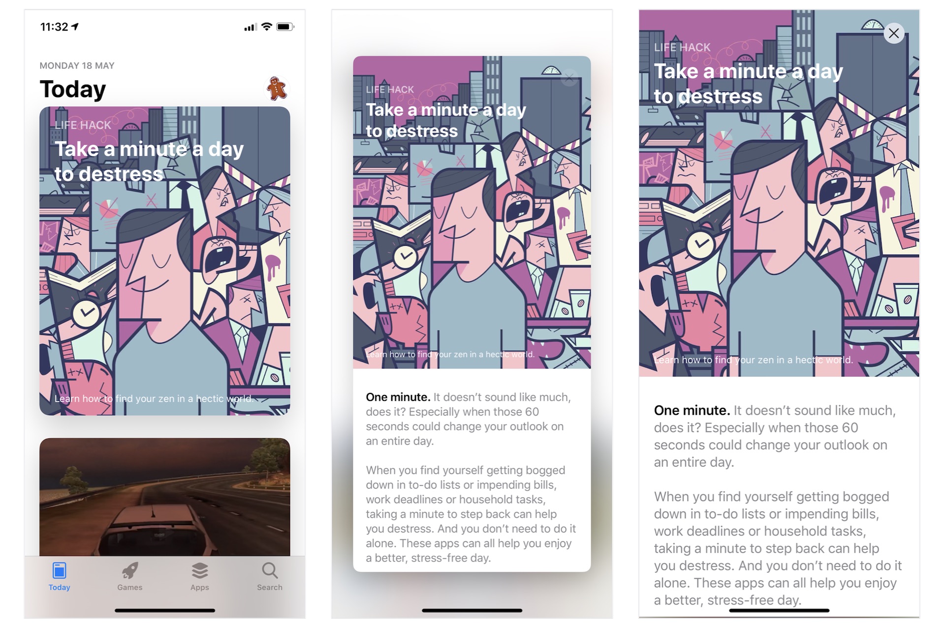
相信你一定使用過 iPhone 內置的 App Store App。 在 Today 部分,它提供一系列的文章和App推薦。 而作為App開發者,最令我感興趣的是它使用的動畫視圖轉換效果。 正如圖 26.1 顯示,文章以卡片形式列出。 當你點擊它時,卡片會彈出以顯示全部內容。要關閉文章視圖並返回列表視圖,你只需點擊關閉按鈕 。 如果你不明白我的意思,我提議你立刻在 iPhone 上打開 App Store 試一試。
在本章中,我們將構建一個類似的列表視圖並使用 SwiftUI 實作動畫過渡。 透過建立範例App,你將學習以下技術:
- 如何使用 GeometryReader 檢測螢幕尺寸
- 如何創建可變大變小的卡片視圖(Card View)
- 如何實作類似 App Store 內的視圖轉換動畫效果
酷!讓我們開始吧。
範例 App 簡介
像往常一樣,我們將一起構建一個範例 App。 App看起來與 App Store App 非常相似,只是沒有標籤列(Tab Bar)。 打開App 後會見到一個列表視圖,以卡片格式顯示所有文章。 當使用者點擊任何文章時,卡片會擴展為全螢幕並顯示整篇文章。 要返回列表視圖,使用者可以點擊關閉按鈕或向下拖動文章視圖。
我們將由零開始建立App, 但是為了節省你一些時間,我已準備了一個Starter專案。 你可以從 https://www.appcoda.com/resources/swiftui5/SwiftUIAppStoreStarter.zip 下載它。 下載項目後,解壓後並打開SwiftUIAppStore.xcodeproj查看一下。
這個Starter專案已經為了實作以下項目:
- 它已經將所需的圖像加進 Assets。
ContentView.swift是 Xcode 自動生成的SwiftUI 視圖。Article.swift包含Article結構,用於代表App內的文章。 因為是範例關係,Starter專案還包含一些測試數據(sampleArticles陣列)。 如果你想加入更多文章,你可以隨便修改sampleArticles。
了解卡片視圖
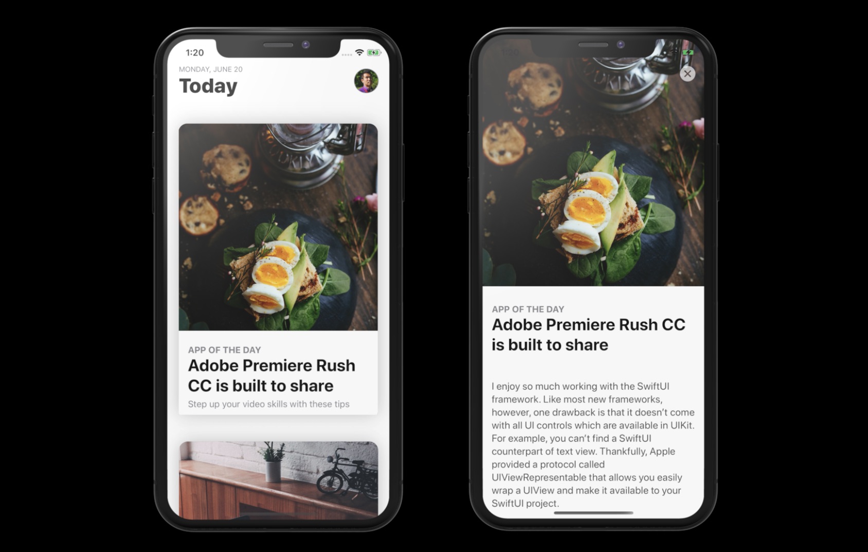
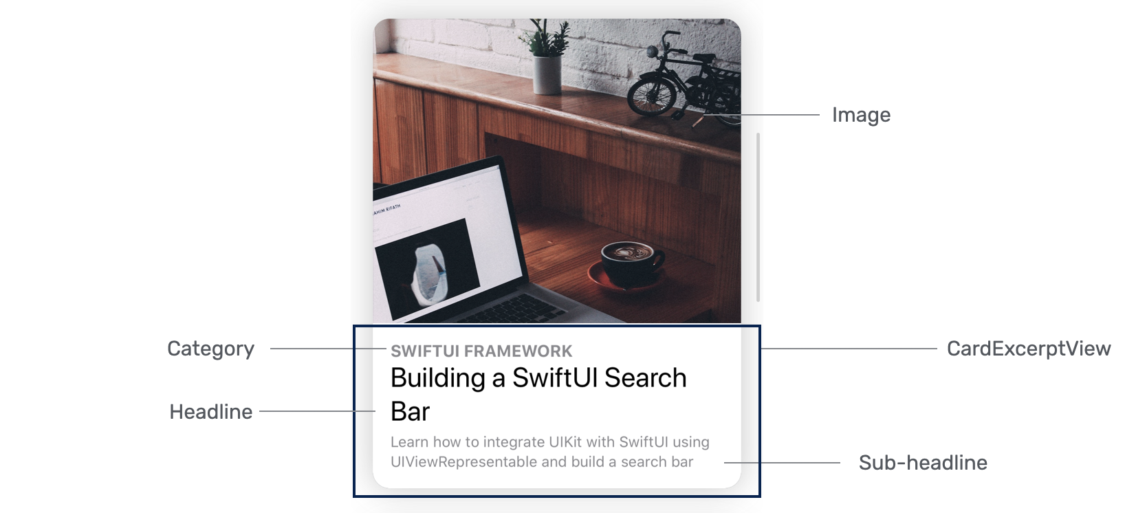
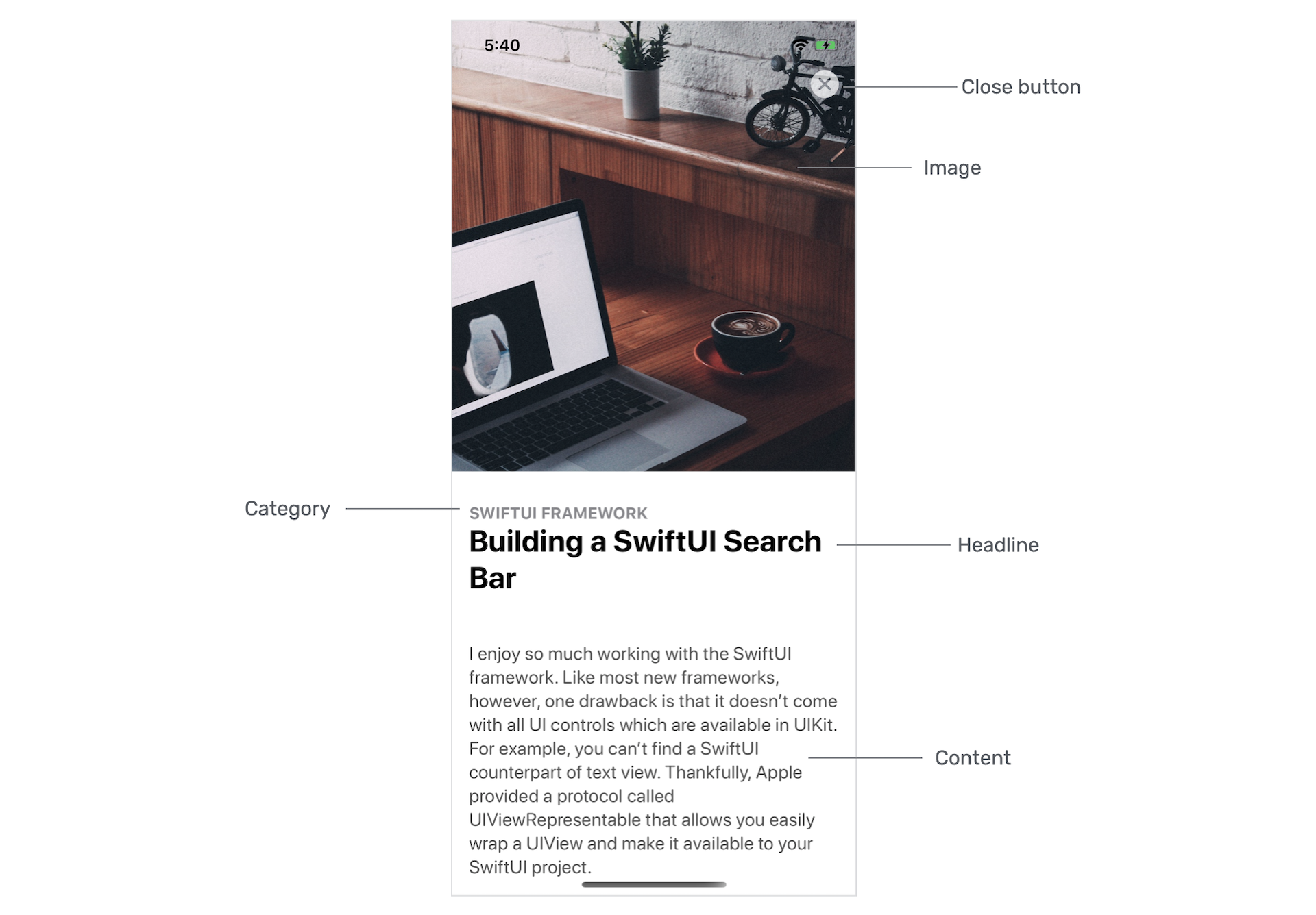
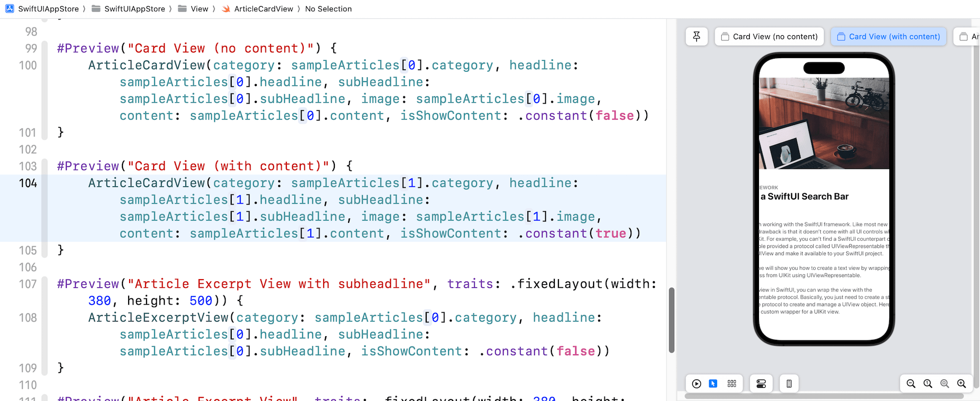
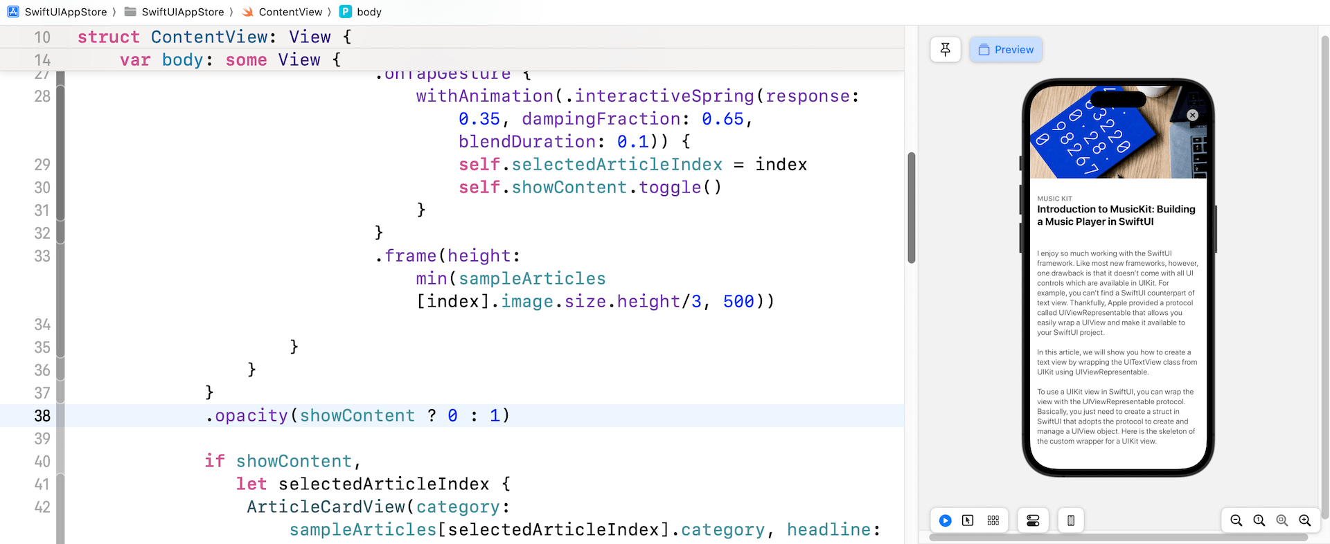
你之前已經學習過如何創建類似卡片式UI。 這個卡片視圖與第 5 章中做的非常相似,但它會更加靈活並且支援滾動內容。 換句話說,它有兩種模式:節錄和完整內容。 在節錄模式下,只顯示文章的圖片、類別、標題和副標題。 完整內容模式則顯示文章詳細內容,如圖26.2所示。
如果你仔細觀察圖 26.4 所示的卡片視圖,你會發現卡片視圖的大小會根據圖像的高度而變化。 但是,卡片的高度不會超過 500 點。
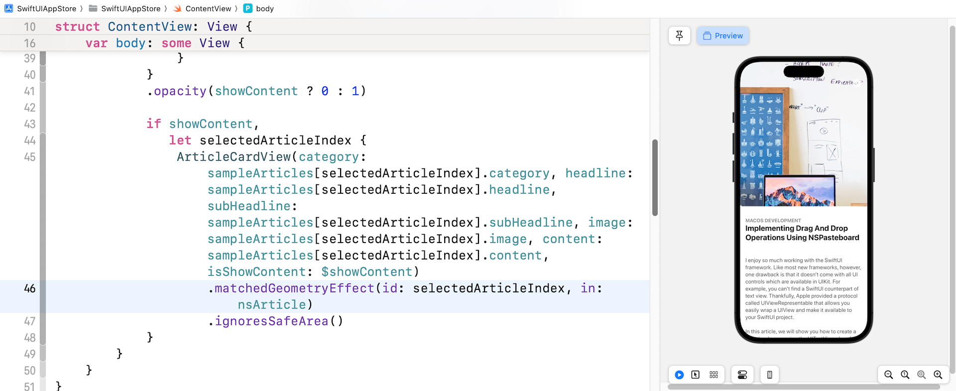
讓我們也看看卡片視圖在完整內容模式下的外觀。 如下圖所示,卡片視圖展開以全螢幕顯示內容。 除此之外,圖像變大了,副標題則被隱藏。 此外,關閉按鈕會出現在屏幕上,讓使用者關閉視圖。 還有,這是一個可滾動的視圖。
實作卡片視圖
現在你了解了此卡片視圖的要求,讓我們看看如何建立它。 我們將使用一個新文檔來建立卡片視圖。 在項目導航器中,右點 View 文件夾並選擇 New file...。 選擇 SwiftUI View 模板並將文件命名為 ArticleCardView.swift。
首先,讓我們從節錄視圖開始,它是覆蓋在圖像頂部的視圖(圖 26.5)。 將程式碼更新如下:
struct ArticleExcerptView: View {

    let category: String
    let headline: String
    let subHeadline: String

    @Binding var isShowContent: Bool

    var body: some View {
        VStack(alignment: .leading) {
            Spacer()

            Rectangle()
                .frame(minHeight: 100, maxHeight: 150)
                .overlay(
                    HStack {
                        VStack(alignment: .leading) {
                            Text(self.category.uppercased())
                                .font(.subheadline)
                                .fontWeight(.bold)
                                .foregroundStyle(Color.secondary)

                            Text(self.headline)
                                .font(.title)
                                .fontWeight(.bold)
                                .foregroundStyle(Color.primary)
                                .minimumScaleFactor(0.1)
                                .lineLimit(2)
                                .padding(.bottom, 5)

                            if !self.isShowContent {
                                Text(self.subHeadline)
                                    .font(.subheadline)
                                    .foregroundStyle(Color.secondary)
                                    .minimumScaleFactor(0.1)
                                    .lineLimit(3)

                            }
                        }
                        .padding()

                        Spacer()
                    }
            )
        }
        .foregroundStyle(.white)

    }
}
ArticleExcerptView 能靈活地顯示不同的內容。 因此,我們定義了上面的變數。 如前所述,卡片視圖應該能夠在 excerpt 和 full content 模式之間切換。 那個綁定變數(即isShowContent)就是用於控制內容的模式。 當它的值設定為 false 時,它處於節錄模式。 相反,當它為 true 時,它處於完整內容模式。 副標題要在 isShowContent 設定為 true 時才會出現。
其實有多種方法來佈局節錄視圖。 在上面的程式碼,我們創建一個 Rectangle 視圖並用標題和子標題覆蓋它。 你應該非常熟悉那些附加到Text視圖的修飾器, 但是 minimumScaleFactor 修飾器值得一提。 通過此修飾器,系統會跟據可用空間的大小自動將字體縮小。 例如,如果標題包含太多文字,iOS 會將它縮小 10%。
預覽使用者界面
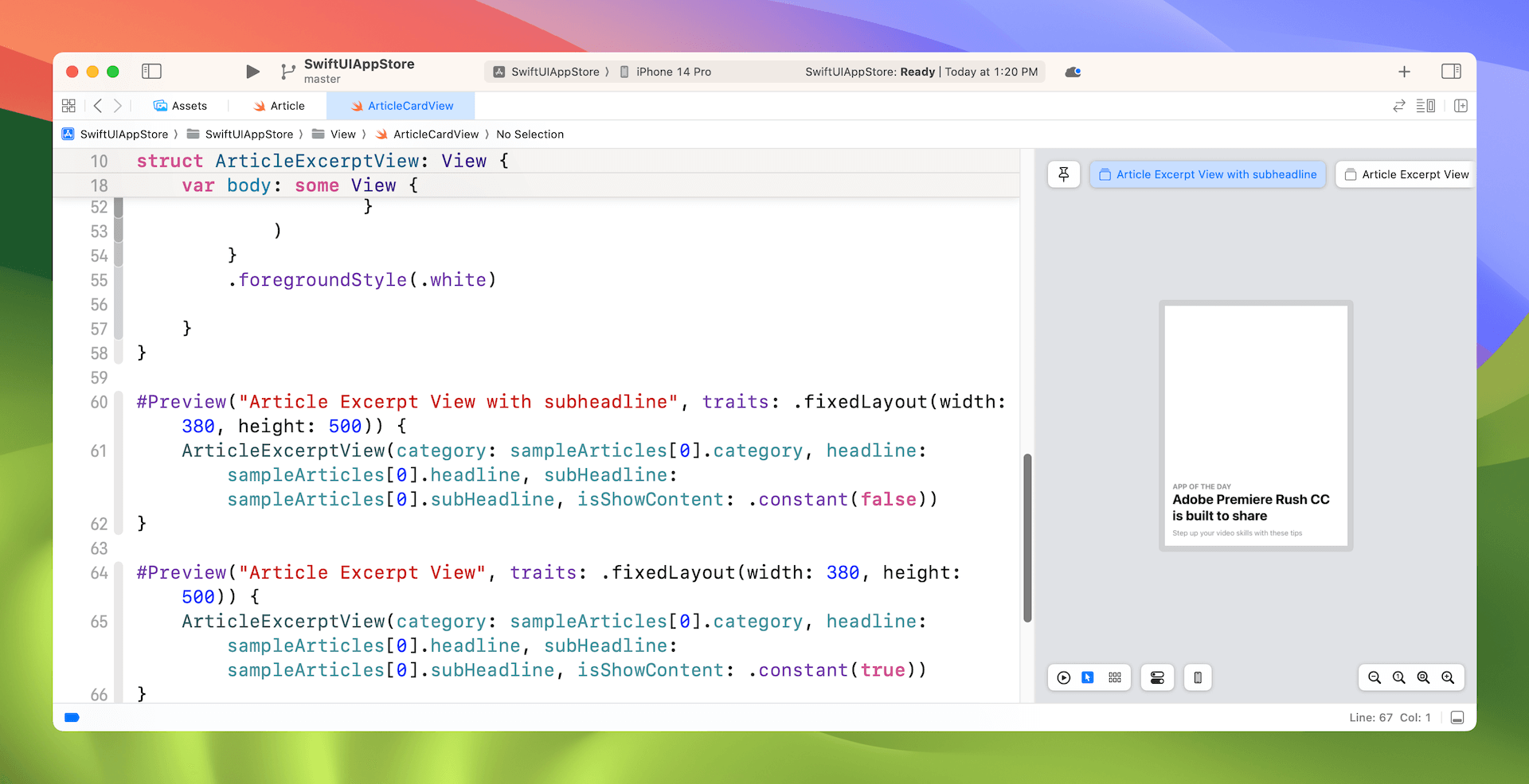
要預覽節錄視圖,你可以像這樣修改預覽程式碼:
#Preview("Article Excerpt View with subheadline", traits: .fixedLayout(width: 380, height: 500)) {
    ArticleExcerptView(category: sampleArticles[0].category, headline: sampleArticles[0].headline, subHeadline: sampleArticles[0].subHeadline, isShowContent: .constant(false))
}

#Preview("Article Excerpt View", traits: .fixedLayout(width: 380, height: 500)) {
    ArticleExcerptView(category: sampleArticles[0].category, headline: sampleArticles[0].headline, subHeadline: sampleArticles[0].subHeadline, isShowContent: .constant(true))
}
因為想預覽兩種模式,我們建立兩個節錄視圖。一個將isShowContent綁定設定為false,另一個則為true。 sampleArticles 陣列是Starter專案附帶的測試數據。
我們不使用裝置預覽,而是在固定大小的矩形中預覽 UI。 如果一切正常,你應該會在預覽畫面中看到節錄視圖。請確保你更改為 Selectable 模式以預覽固定佈局。
準備好節錄視圖後,讓我們實作文章卡片視圖。 像這樣更新 ArticleCardView 結構:
struct ArticleCardView: View {

    let category: String
    let headline: String
    let subHeadline: String
    let image: UIImage
    var content: String = ""

    @Binding var isShowContent: Bool

    var body: some View {
        ScrollView {
            VStack(alignment: .leading) {
                Image(uiImage: self.image)
                    .resizable()
                    .scaledToFill()
                    .frame(height: min(self.image.size.height/3, 500))
                    .border(Color(.sRGB, red: 150/255, green: 150/255, blue: 150/255, opacity: 0.1), width: self.isShowContent ? 0 : 1)
                    .cornerRadius(15)
                    .overlay(
                        ArticleExcerptView(category: self.category, headline: self.headline, subHeadline: self.subHeadline, isShowContent: self.$isShowContent)
                            .cornerRadius(self.isShowContent ? 0 : 15)
                    )

                // Content
                if self.isShowContent {
                    Text(self.content)
                        .foregroundStyle(Color(.darkGray))
                        .font(.system(.body, design: .rounded))
                        .padding(.horizontal)
                        .padding(.bottom, 50)
                        .transition(.move(edge: .bottom))
                }
            }
        }
        .shadow(color: Color(.sRGB, red: 64/255, green: 64/255, blue: 64/255, opacity: 0.3), radius: self.isShowContent ? 0 : 15)
    }
}
為了做出卡片視圖的佈局,我們將 ArticleExcerptView 覆蓋在 Image 視圖之上。 圖像視圖設定為 .scaledToFill,高度不可超過 500 點。 而且是當 isShowContent 綁定設定為 true 時,才會顯示 content。
為了使視圖可滾動,我們將 VStack 嵌入到ScrollView視圖中。 shadow 修飾器用於為卡片視圖添加陰影。
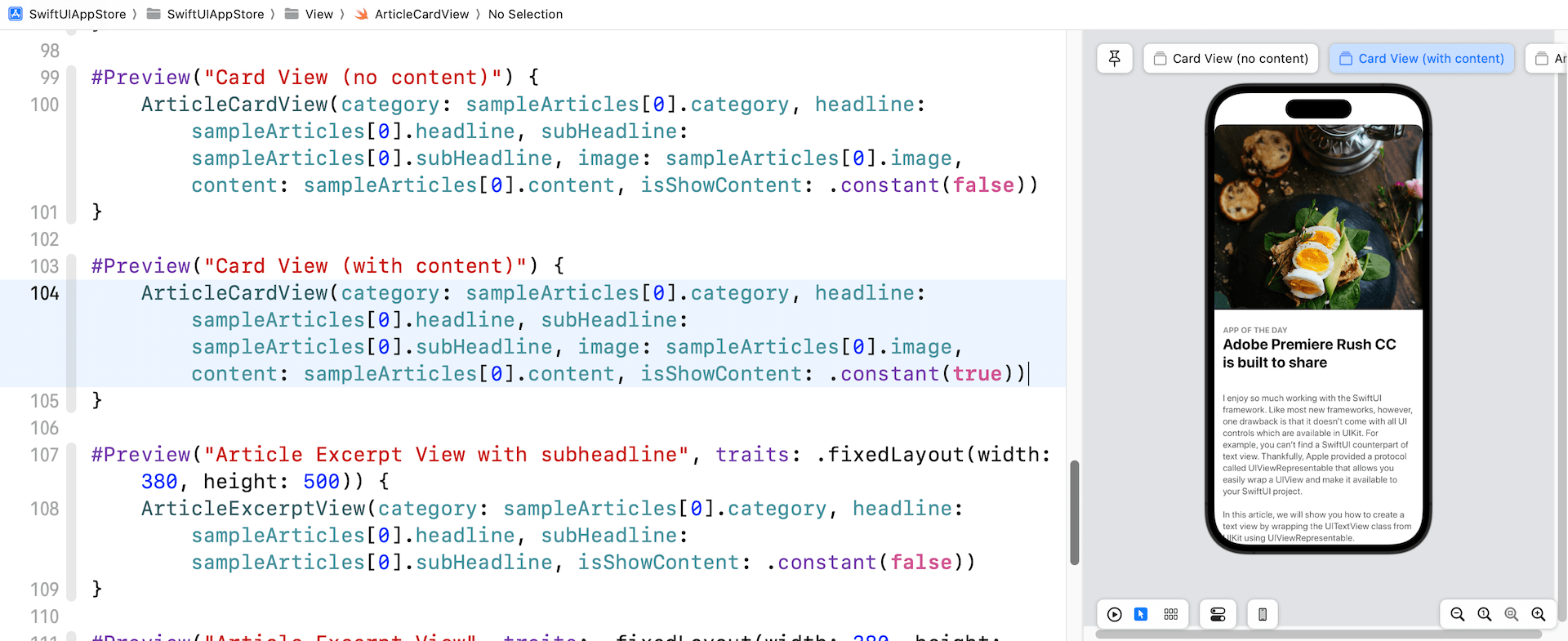
要預覽文章卡片視圖,你可以加入以下程式碼:
ArticleCardView(category: sampleArticles[0].category, headline: sampleArticles[0].headline, subHeadline: sampleArticles[0].subHeadline, image: sampleArticles[0].image, content: sampleArticles[0].content, isShowContent: .constant(false))
    .previewDisplayName("Card View (no Content)")

ArticleCardView(category: sampleArticles[0].category, headline: sampleArticles[0].headline, subHeadline: sampleArticles[0].subHeadline, image: sampleArticles[0].image, content: sampleArticles[0].content, isShowContent: .constant(true))
    .previewDisplayName("Card View (with Content)")
進行更改後,你應該能夠在預覽畫面中看到卡片 UI。 此外,你應該看到兩個模擬器,一個顯示節錄視圖,另一個顯示完整內容。
使用 GeometryReader
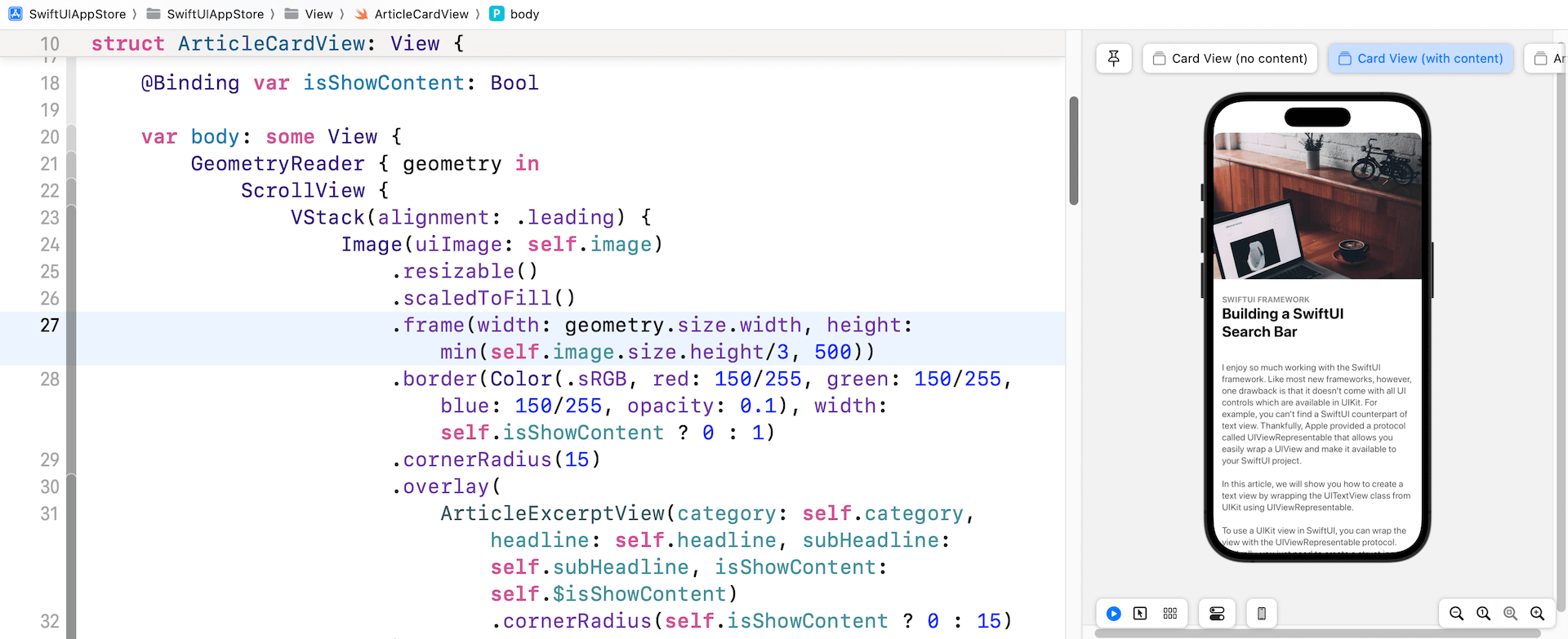
似乎一切都很好。 但是,如果你嘗試使用另一篇示例文章(例如,sampleArticles[1])預覽卡片視圖,則 UI 看起來不太好。 圖像和內容都超出了螢幕邊緣。
讓我們再看看之前的程式碼。 對於 Image 視圖,我們只限制了圖像的高度,對它的寬度沒有任何限制:
.frame(height: min(self.image.size.height/3, 500))
為了解決這個問題,我們必須限制frame的寬度並確保它不超過螢幕的寬度。 問題是如何找出螢幕的寬度? SwiftUI 提供了一個名為GeometryReader的容器視圖,可以讀取parent view的大小。 因此,我們需要將 ScrollView 嵌入到 GeometryReader 中,如下所示:
var body: some View {
    GeometryReader { geometry in
        ScrollView {
            VStack(alignment: .leading) {
                .
                .
                .
            }
        }
        .shadow(color: Color(.sRGB, red: 64/255, green: 64/255, blue: 64/255, opacity: 0.3), radius: self.isShowContent ? 0 : 15)
    }
}
在 GeometryReader 的閉包中,它有一個參數,可以為你提供有關視圖的額外資料,例如大小和位置。 要將框架的寬度限制為螢幕大小的話,我鄶就可以像這樣修改 .frame 修飾器:
.frame(width: geometry.size.width, height: min(self.image.size.height/3, 500))
在程式碼中,我們將寬度設定為螢幕寬度。 完成更改後,就可以解決之前遇到的問題。
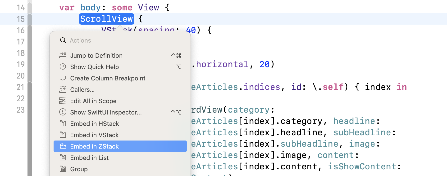
添加關閉按鈕
卡片視圖幾乎完成了,但還剩下一件事。 我們還沒有加入關閉按鈕。 為了將按鈕覆蓋在圖像頂部,我們要將滾動視圖嵌入到ZStack中。 你可以直接修改程式碼以添加ZStack,但這裡讓我試範另一種方法。按住 control 鍵並單擊ScrollView,你應該會看到一個選單。 選擇 Embed in ZStack 將滾動視圖嵌入到 ZStack 中。
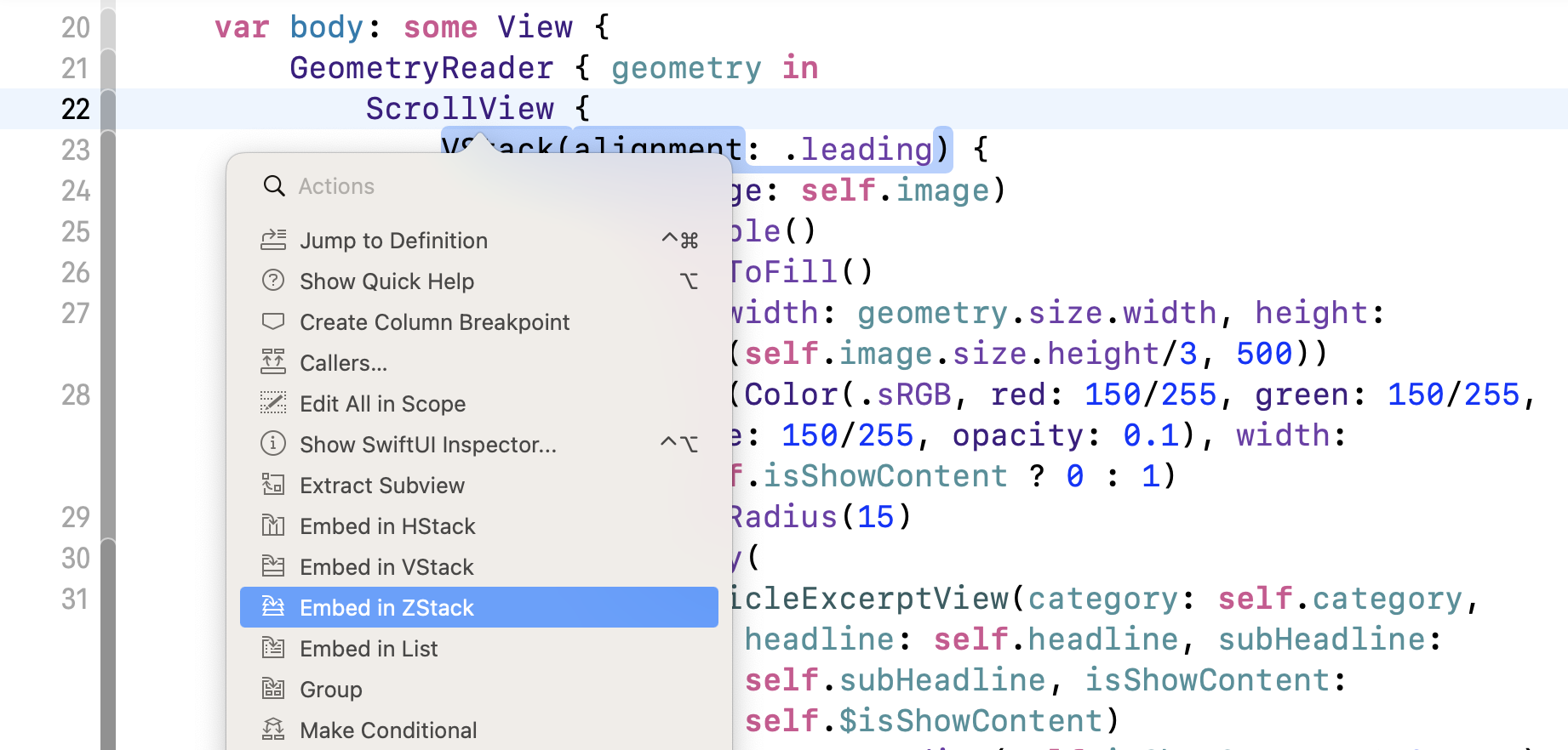
Xcode 會自動將程式碼縮排並將滾動視圖嵌入到 ZStack 中。 現在更改 ZStack ,將 alignment 設定為 .topTrailing。這樣就可以將關閉按鈕放置在右上角的地方。 你的程式碼應如下所示:
var body: some View {
    GeometryReader { geometry in
        ZStack(alignment: .topTrailing) {
            ScrollView {
                VStack(alignment: .leading) {
                    .
                    .
                    .
                }
            }
            .shadow(color: Color(.sRGB, red: 64/255, green: 64/255, blue: 64/255, opacity: 0.3), radius: self.isShowContent ? 0 : 15)
        }
    }
}
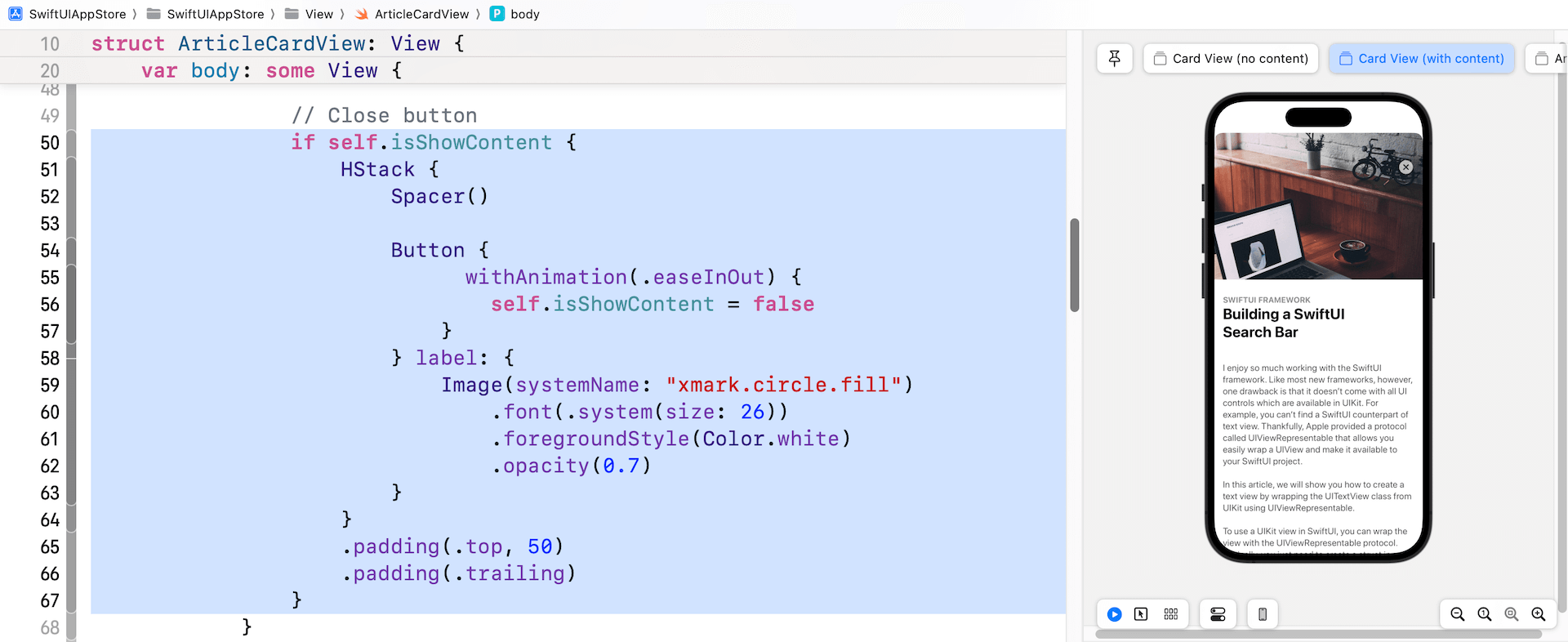
接下來,在 .shadow 修飾器正下方加入以下程式碼以添加關閉按鈕:
if self.isShowContent {
    HStack {
        Spacer()

        Button {
              withAnimation(.easeInOut) {
                self.isShowContent = false
            }
        } label: {
            Image(systemName: "xmark.circle.fill")
                .font(.system(size: 26))
                .foregroundStyle(Color.white)
                .opacity(0.7)
        }
    }
    .padding(.top, 50)
    .padding(.trailing)
}
修改後,當 isShowContent 的值設定為 true 時,預覽就會顯示關閉按鈕。
構建列表視圖
現在我們已經實作了卡片視圖的佈局,讓我們切換到 ContentView.swift 並創建列表視圖。 在列表視圖的最頂部,是帶有標題和個人資料照片的頂部欄(Top Bar)。

我相信你應該知道如何使用 VStack 和 HStack 來佈局。 為了將程式碼整理得更好,我將在兩個獨立的結構中創建頂部欄和頭像。 在 ContentView.swift 中插入以下程式碼:
struct TopBarView : View {

    var body: some View {
        HStack(alignment: .lastTextBaseline) {
            VStack(alignment: .leading) {
                Text(getCurrentDate().uppercased())
                    .font(.caption)
                    .foregroundColor(.secondary)
                Text("Today")
                    .font(.largeTitle)
                    .fontWeight(.heavy)
            }

            Spacer()

            AvatarView(image: "profile", width: 40, height: 40)

        }
    }

    func getCurrentDate(with format: String = "EEEE, MMM d") -> String {
        let dateFormatter = DateFormatter()
        dateFormatter.dateFormat = format
        return dateFormatter.string(from: Date())
    }
}

struct AvatarView: View {
    let image: String
    let width: CGFloat
    let height: CGFloat

    var body: some View {
        Image(image)
            .resizable()
            .frame(width: width, height: height)
            .clipShape(Circle())
            .overlay(Circle().stroke(Color.gray, lineWidth: 1))
    }
}
接下來,像這樣更新 ContentView 的程式碼:
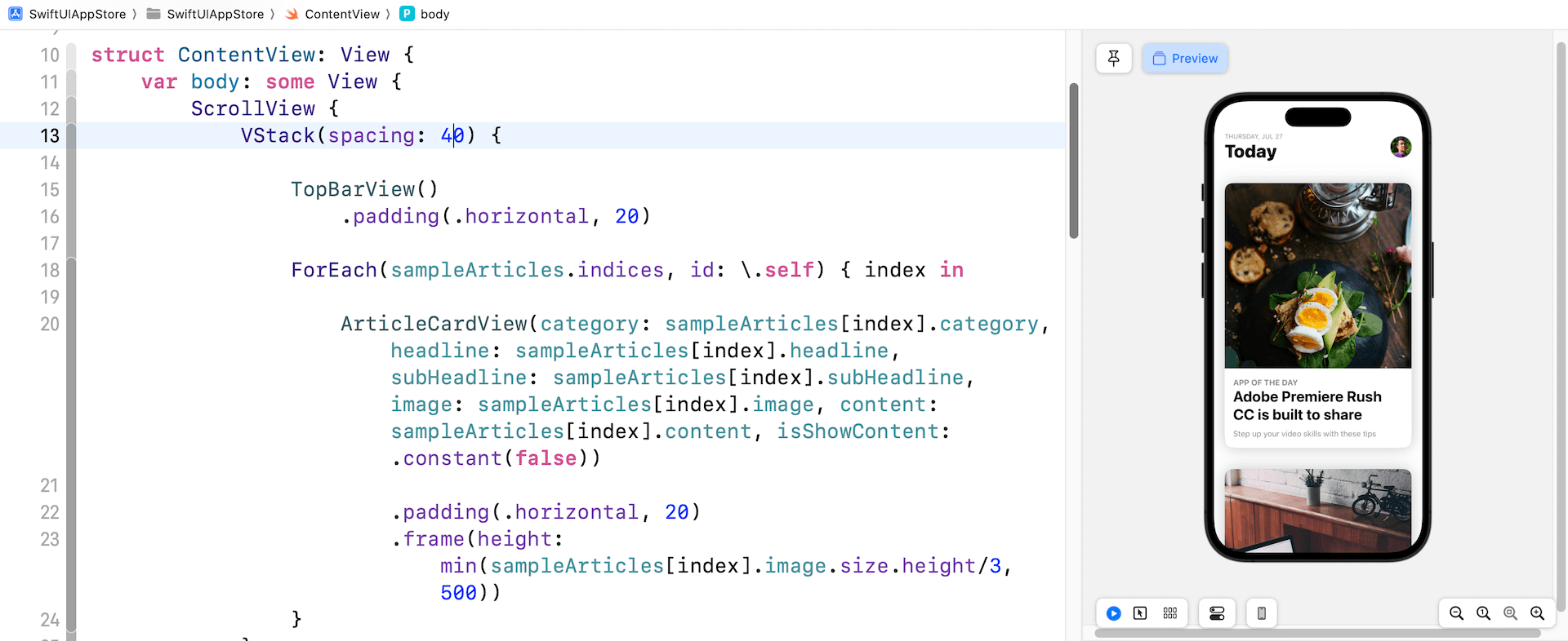
struct ContentView: View {

    var body: some View {
        ScrollView {
            VStack(spacing: 40) {

                TopBarView()
                    .padding(.horizontal, 20)

                ForEach(sampleArticles.indices, id: \.self) { index in

                    ArticleCardView(category: sampleArticles[index].category, headline: sampleArticles[index].headline, subHeadline: sampleArticles[index].subHeadline, image: sampleArticles[index].image, content: sampleArticles[index].content, isShowContent: .constant(false))

                        .padding(.horizontal, 20)
                        .frame(height: min(sampleArticles[index].image.size.height/3, 500))
                }
            }
        }
    }
}
我們在 ScrollView 中嵌入了一個 VStack 來創建垂直滾動視圖。 在程式碼中,我們傳送給ForEach一個sampleArticles陣列,並為每篇文章創建一個ArticleCardView。 如果你的程式碼能正常運作,預覽畫面應該會向顯示文章列表。
將卡片視圖擴展到全螢幕
現在到了最困難的部分。 如何將卡片視圖從節錄模式切換到完整內容模式? 之前,我們將 isShowContent 參數設定為 .constant(false)。 要在這兩種模式之間切換,每個卡片視圖都應該有一個變數來存放其狀態。
因此,在 ContentView 中宣告以下狀態變數:
@State private var showContent = false
在預設情況下,所有卡片視圖都處於摘錄狀態。 因此,showContents 變數的值被設置為 false。 稍後,當一張卡片被點擊時,我們會將狀態從 false 更改為 true。
我們還需要一個變數來儲存所選卡片的索引。 再聲明一個狀態變數:
@State private var selectedArticleIndex: Int?
它被定義為可選的(optional),因為最初並沒有選擇卡片視圖。
現在,修改 ArticleCardView 的初始化程式碼。 我們不再使用 .constant(false),而是將狀態變數的綁定傳遞給它(即 self.$showContents[index]):
ArticleCardView(category: sampleArticles[index].category, headline: sampleArticles[index].headline, subHeadline: sampleArticles[index].subHeadline, image: sampleArticles[index].image, content: sampleArticles[index].content, isShowContent: $showContent)
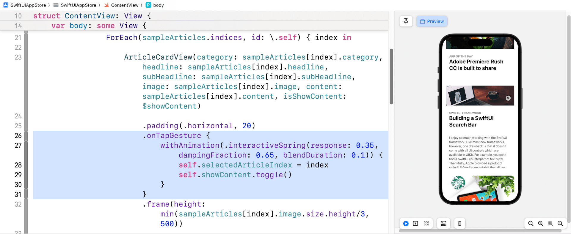
處理點擊手勢
當使用者點擊其中一個卡片視圖時,所選卡片將變為全螢幕模式。 要偵測點擊手勢,請在你剛剛添加的程式碼下方附加 .onTapGesture 修飾器(在.padding(.horizontal, 20)之下加入):
.onTapGesture {
    withAnimation(.interactiveSpring(response: 0.35, dampingFraction: 0.65, blendDuration: 0.1)) {
        self.selectedArticleIndex = index
        self.showContent.toggle()
    }
}
當檢測到點擊手勢時,我們將showContent變數從false更改為true。 同時,我們保存所選卡片視圖的索引。
讓我們快速測試一下App!當你在預覽畫面中運行App時,點擊任何卡片視圖就可以測試到結果。 雖然它沒有像預期般運作,但卡片視圖應該顯示文章的內容並隱藏子標題。 此外,你應該能點擊關閉按鈕以返回節錄模式。 如果看不到內容,請向上拖動卡片視圖以顯示它。
利用 MatchedGeometryEffect 製作過場動畫
我們如何將選定的卡片視圖擴展為全螢幕卡片視圖並為過渡設置動畫? 在第 33 章中,我介紹了一個名為matchedGeometryEffect的修飾器。 使用這個強大的修飾符,你可以描述初始視圖和最終視圖的外觀。 matchedGeometryEffect 然後計算這兩個視圖之間的差異並自動為大小和位置變化設置動畫。
注意:如果你還沒有閱讀第 33 章,請先閱讀本章。
在這個範例中,初始視圖是摘錄模式下的卡片視圖,而最終視圖是顯示完整內容的卡片視圖。 我們要做的是將當前滾動視圖嵌入到一個 ZStack 視圖中。 最初,App顯示卡片視圖列表。 當使用者點擊任何卡片視圖時,我們會將完整內容視圖覆蓋在現有滾動視圖之上。
現在按住命令鍵並單擊 ScrollView。 選擇 Embed in ZStack。
將 ZStack 視圖的 alignment 參數設置為 .top,如下所示:
ZStack(alignment: .top) {

  ScrollView {
    .
    .
    .
  }

}
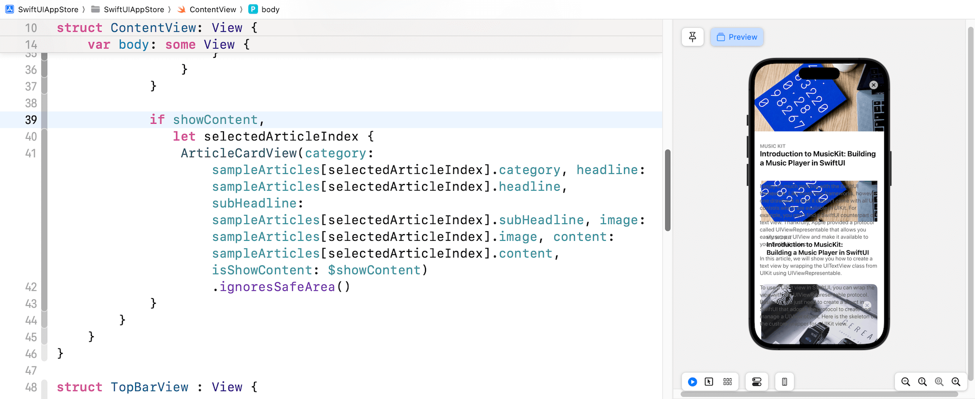
接下來,在滾動視圖的右括號之後插入以下程式碼:
if showContent,
   let selectedArticleIndex {
    ArticleCardView(category: sampleArticles[selectedArticleIndex].category, headline: sampleArticles[selectedArticleIndex].headline, subHeadline: sampleArticles[selectedArticleIndex].subHeadline, image: sampleArticles[selectedArticleIndex].image, content: sampleArticles[selectedArticleIndex].content, isShowContent: $showContent)
        .ignoresSafeArea()
}
當使用者點擊其中一個卡片視圖時,showContent 的值將更改為 true,並且將 selectedArticleIndex 設置為所選卡片視圖的索引。 在這種情況下,我們通過將 isShowContent 參數設置為 true 以完整內容模式顯示卡片視圖。
如果你在預覽畫布中測試App,點擊卡片視圖就會將其內容擴展到全螢幕。
功能上是可以的,但效果看起來並不好。 完整內容卡片視圖後面的列表仍然可見。 當選擇任何卡片視圖時,我們需要將其隱藏起來。 要解決此問題,請將 opacity 修飾器附加到 ScrollView:
.opacity(showContent ? 0 : 1)
當App顯示卡片視圖的全部內容時,我們將滾動視圖的不透明度設置為 0。 再次測試App。 卡片視圖應正確顯示完整內容。
我們需要做的最後一件事是設置過場動畫。 如本節初所述,我們可以利用 matchedGeometryEffect 修飾器讓 SwiftUI 渲染過渡動畫。
要使用修飾器,我們首先必須定義一個命名空間變數:
@Namespace var nsArticle
接下來,將 matchedGeometryEffect 修飾器附加到 ForEach 中的 ArticleCardView:
.matchedGeometryEffect(id: index, in: nsArticle)
You can place the line of code above before the onTapGesture modifier. For the ArticleCardView, attach another matchedGeometryEffect modifier and use the same namespace (insert it above the ignoresSafeArea modifier):
你可以將上面的程式碼行放在 onTapGesture 修飾器之前。 至於 ArticleCardView,附加另一個 matchedGeometryEffect 修飾器並使用相同的命名空間(將其加到 ignoresSafeArea 修飾器上方):
.matchedGeometryEffect(id: selectedArticleIndex, in: nsArticle)
通過上面的實現,SwiftUI 會自動計算視圖轉換動畫。
放大圖像
我們還未完成喔。 儘管我們解決了其中一個主要問題,但仍有一些問題在等待我們。 接下來是特色圖片。 在完整內容模式下,我想讓圖像更大一點。 只需切換到 ArticleCardView.swift 並更改 Image 視圖的 .frame 修飾器,如下所示:
.frame(width: geometry.size.width, height: self.isShowContent ? geometry.size.height * 0.7 : min(self.image.size.height/3, 500))
當卡片視圖顯示文章內容時,圖像高度現在調整為螢幕高度的 70%。 你可以更改這個值以配合你的個人偏好。 現在回到 ContentView.swift 並測試更改, 特色圖像在全內容模式下會變大。
總結
恭喜!你構建了一個類似於 App Store app 的動畫。 在實作了這個示範 App 之後,我希望你了解如何創建複雜的視圖動畫,並了解如何使用 GeometryReader 來完善你的 UI。
動畫已成為手機 App UI 的重要部分。 如你所見,SwiftUI 讓開發人員可以非常輕鬆地構建一些漂亮的動畫和視圖過渡效果。 當你開發下一個App時,不要忘記應用在本章中所學到的技術,來提升使用者體驗。
在本章所準備的範例檔中,有最後完整的 Xcode 專案,可供你下載參考:
https://www.appcoda.com/resources/swiftui5/SwiftUIAppStore.zip